from small acorns, great brands grow.
OVErvIEW
The season had just turned from the exuberance of summer to the introspection of autumn when four intrepid biologists Erin, Brandon, Jane, and Will approached me to craft a fresh new brand for Deadfall Brewing.
Guided by their deep understanding of the natural world, the crew were looking for a visual identity that would paint a vivid portrait of the eternal cycles of growth, decay, and regrowth as it relates to the science of brewing and fermentation.
Background
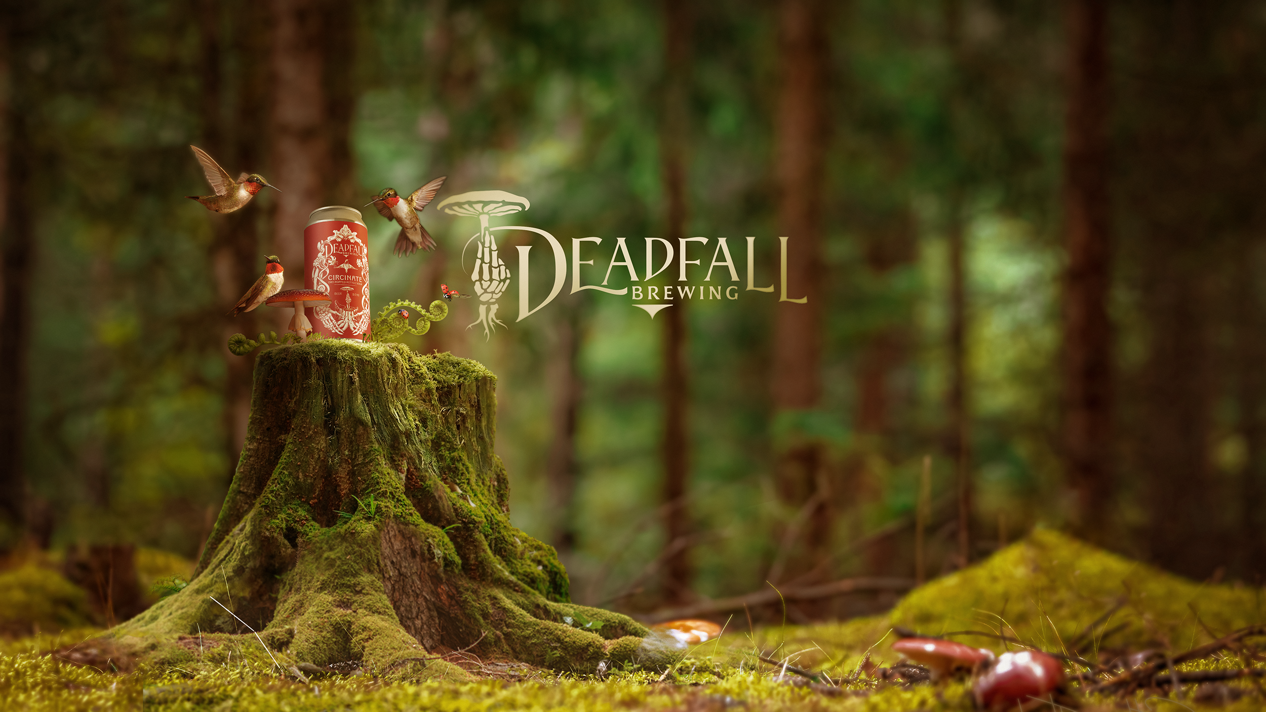
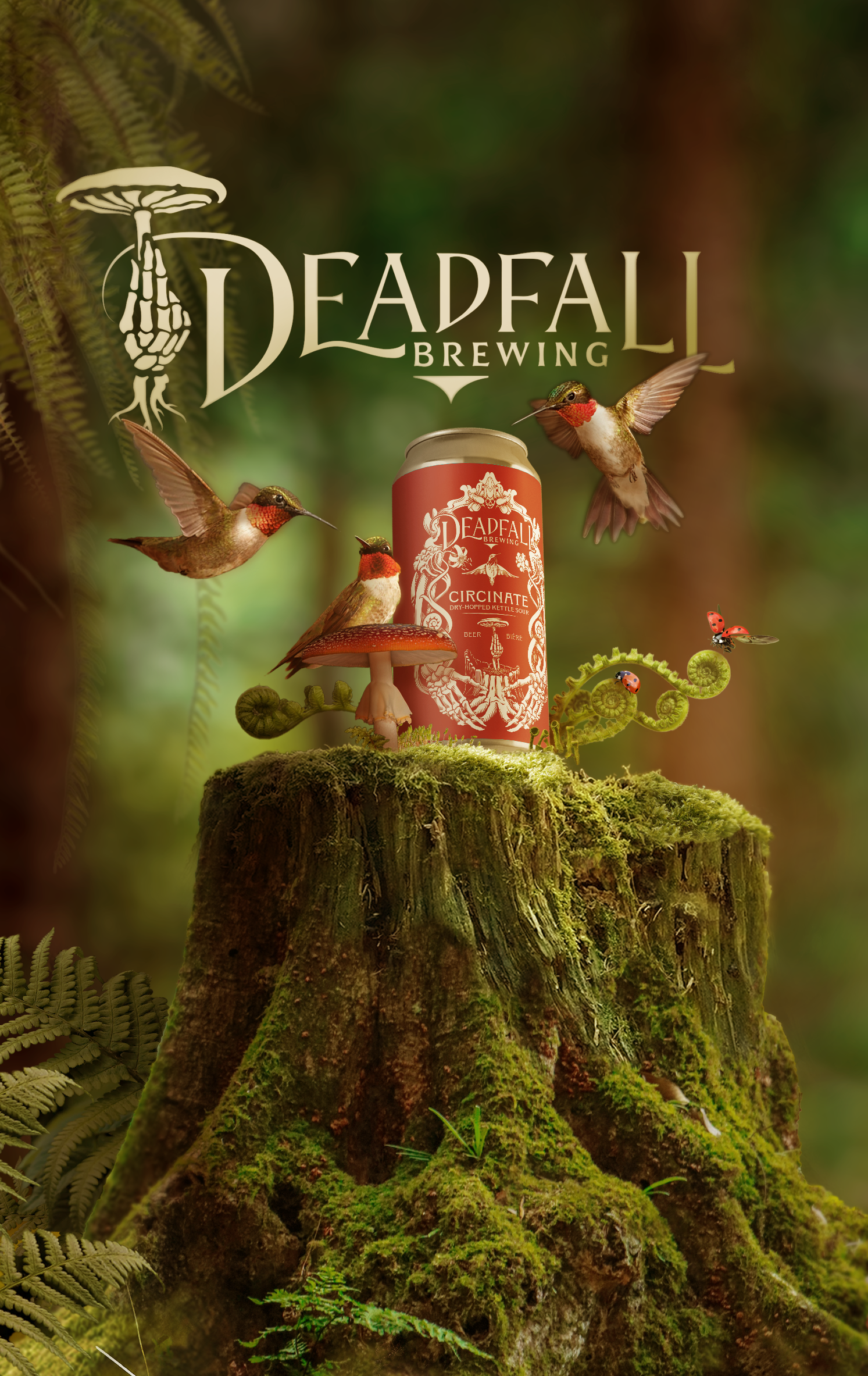
Together the group had already chosen a name - Deadfall Brewing. Deadfall is the name given to trees in the forest at the end of their life cycle that fall, decay and return their nutrients to the forest floor to provide growth for new life.
The idea was to tie the notion of the forest, giving of itself to sustain itself, to the hard work and sacrifice it takes to brew beer and create a vital community around a welcoming, inclusive tap room.
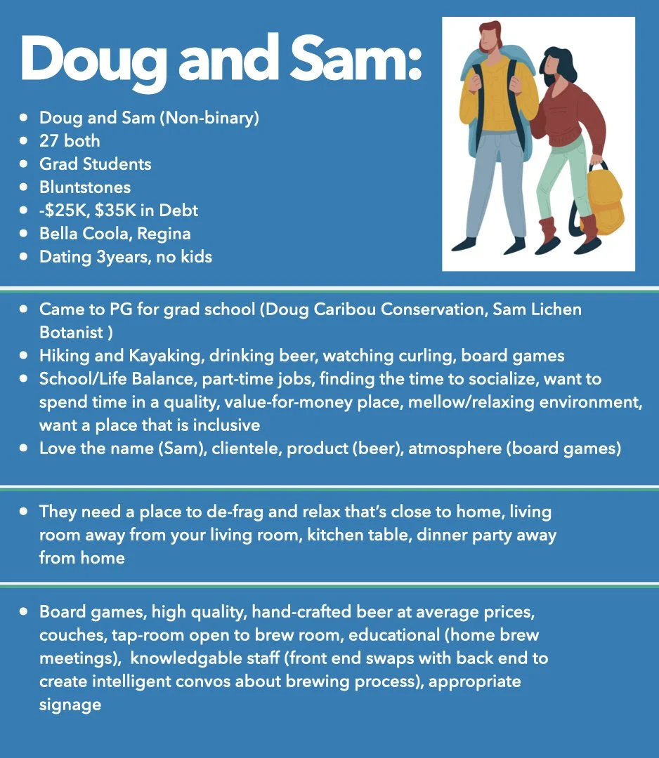
In our initial conversation, we identified one of the main goals of the brand was to appeal to the diverse groups represented in Prince George. From industrial workers employed in forestry and mining to college students at UNBC, creating a brand that spoke to both groups authentically without alienating either would be key.
With a strong name underscored by the strong theme of regrowth and a clear sense of what the new brand was going to need to accomplish, we embarked on our Discovery Sessions with a solid sense we were standing on firm ground.
Process
Over three 1-2 hour Discovery sessions we dove into defining who it was we were talking to, what we were trying to communicate and how we were going to say it.
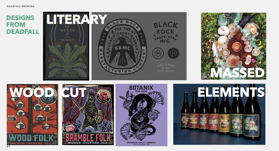
Working through several facilitated sessions produced a series of customer profiles, brand attributes and style scapes that pointed in the direction of a brand that appealed to Prince George’s diversity while paying homage to the grass roots of the forestry industry that dominated that area of the province.
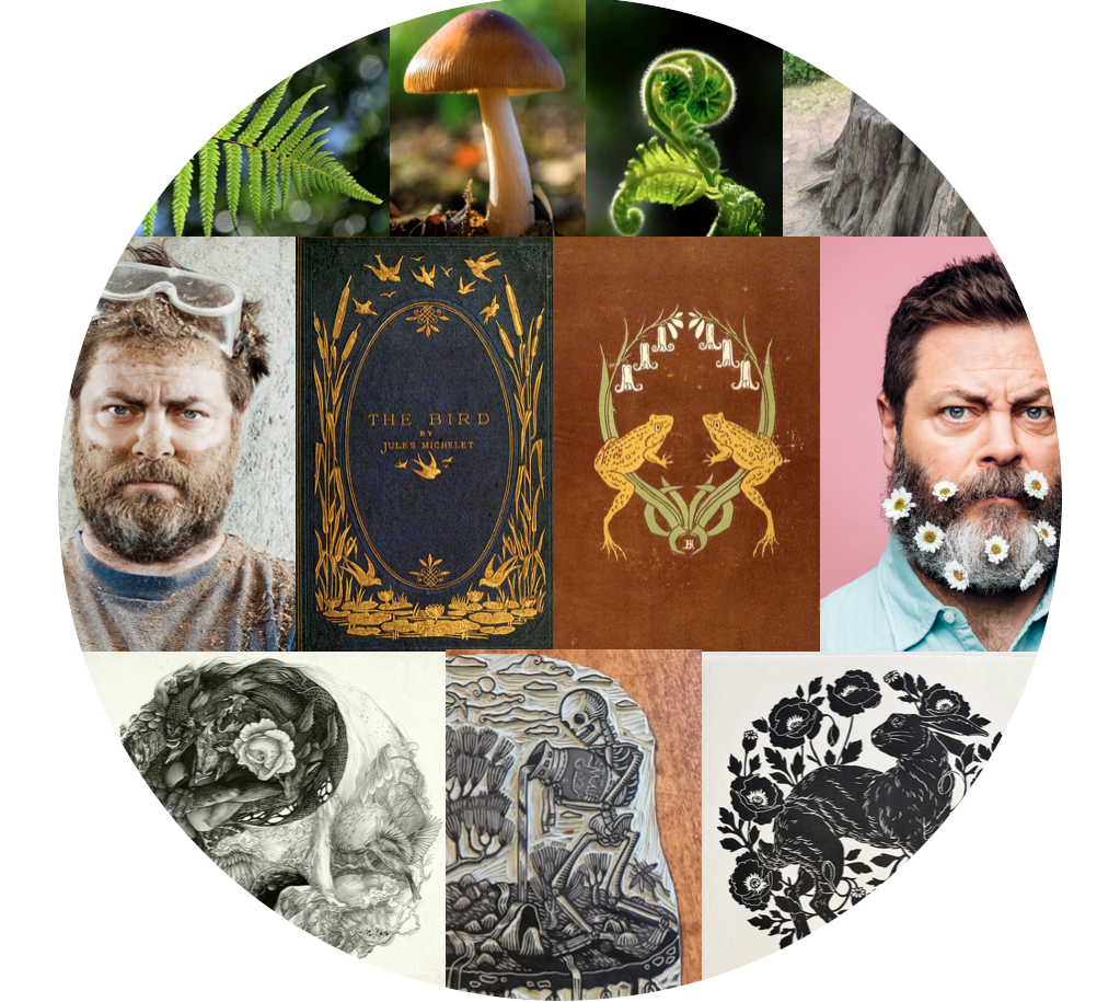
Taking cues from the forest life that had inspired the name and underscored much of the industry in Prince George, a visual identity was created that used the massing of individual organic elements into a larger visual composition that illustrated the cyclical nature of growth and decay.
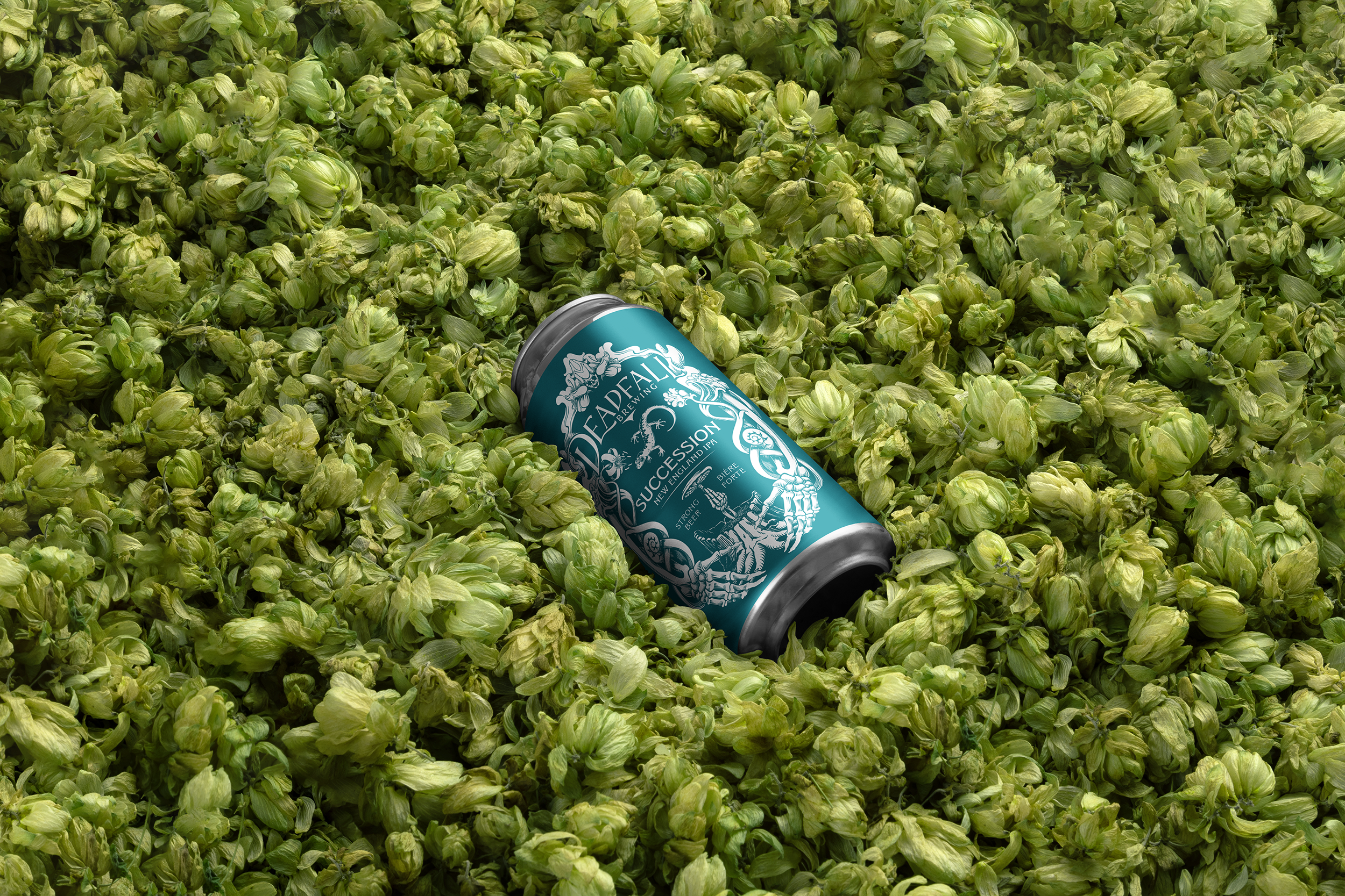
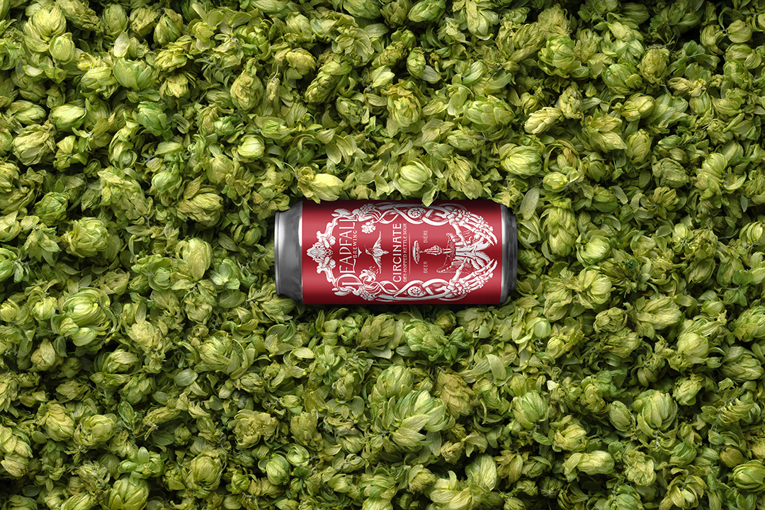
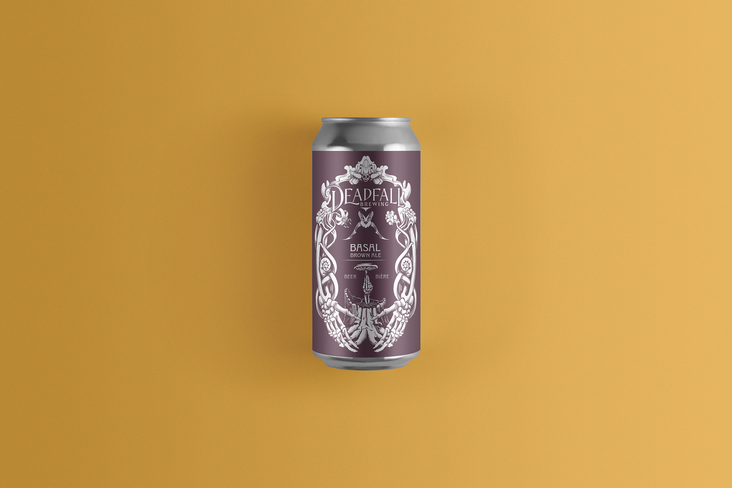
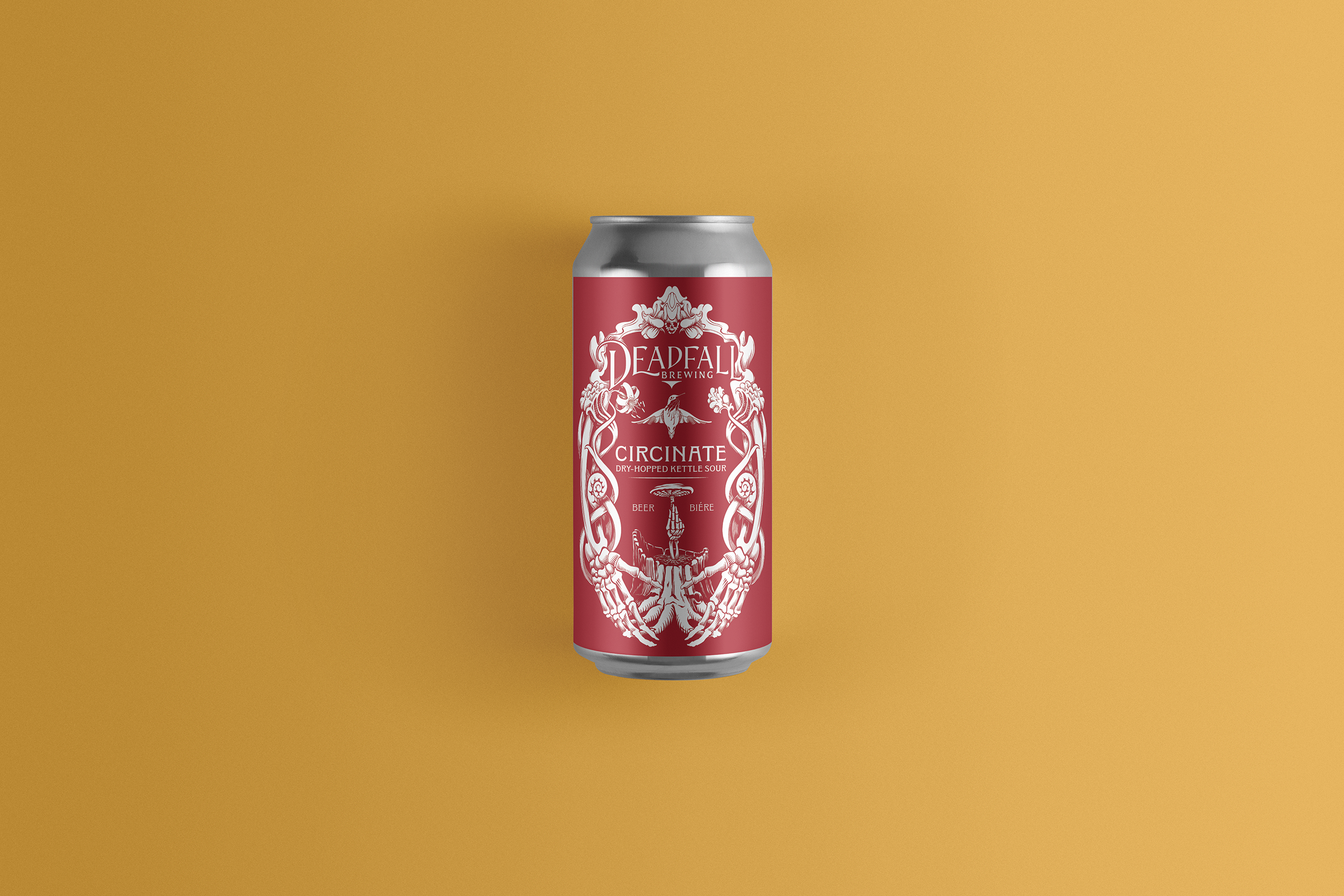
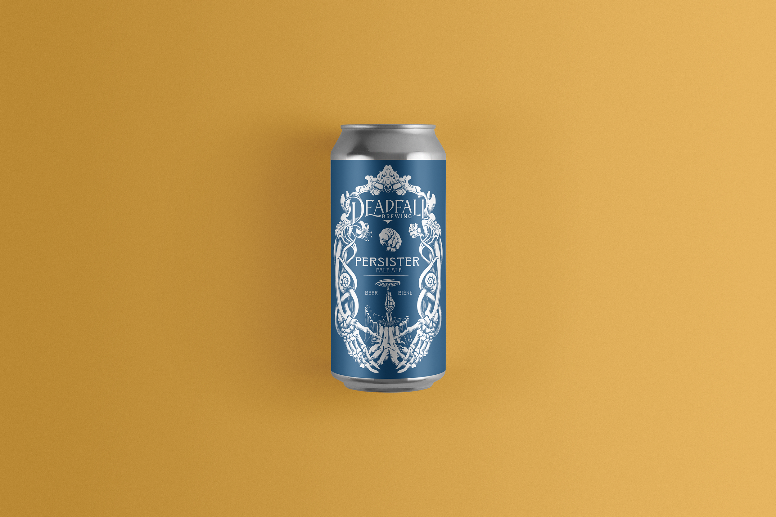
Fiddle heads and tiger lilies grow upward, entwining two skeletal hands reaching down to cradle a decaying stump, while a mushroom springs to life from its centre, held by a third skeletal hand. The hand and mushroom would eventually be chosen to stand alone as the breweries logo.
A cohesive colour pallet was chosen to create a unified feel to their line up of core beers and, to further distinguish the separate products, each brew was given an animal icon native to the Prince George area.

“Skyler took very (at times wildly) disparate opinions from the entire ownership group and melded them into a single, cohesive, strong brand that we love and feel represents us all. ”
Outcome
Building the Deadfall brand was a process of connecting to the creative force of Erin, Brandon, Jane and Will, who came together to create something wonderful, and turning that passion into a visual identity that would inspire new customers to feel the thought, care and intelligence these four friends put into their brews, business and brand.
Overall, it was an exciting and collaborative experience working with these passionate scientists to create a brand that truly reflects their love and appreciation for the complexities of life and the brewing of beer.