Rustic surroundings yield refined design
OVErvIEW
When Dermott and Danielle Hutton's acquired the 26-year-old Fairview Cellars from founder Bill Eggars they were excited to continue the legacy of the brand while also updating it to reflect the sophistication customers had come to appreciate in their wines.
They understood the importance of preserving the heritage of the winery and its location near the historic Fairview townsite, while also pushing it forward into the future. The Huttons' passion for wine, paired with their appreciation for the land and its history, resulted in a brand that acts as a beautiful tribute to the legacy of the winery and the area where it originated.
Background
Fairview Cellars is a boutique winery in South Okanagan, and takes great pride in having produced some of the most delicious and bold red wines in the South Okanagan for the last 26 years.
Their 10-acre vineyard, located at the northern tip of the region's Golden Mile, has enabled them to bring only the best grapes to their winemaking process.
Their founder, Bill Eggert, laid the foundation for their wine standards and today, under the leadership of Danielle and Dermott Hutton, they remain wholly committed to the art of crafting wines from the heart, for the heart.
In our initial conversation, we identified the key to a successful rebrand would to pay tribute to the quarter century of history the original brand had behind it as well as the loyal customer base, while updating it to modern expectations and aesthetics for wine branding.
Process
Through several deep diving conversations over coffee, held in Danielle and Dermott’s living room, we were able to identify their ideal customer profiles and brand attributes. It became clear that the brand messaging needed to focus on customers who appreciated the history and unique wines that their vineyard produced. From impassioned wine store employees to jet-setting globe-trotters, we knew that these customers needed to resonate with the Fairview Cellars brand.
By honing in on our target audience we were able to craft a message that spoke to their values and interests. Fairview Cellars’ customers are well educated in wine and where to find it. They enjoy going out of their way to find new tastes and experiences that they can bring home and share with their loved ones and community.
We summarized these customers in two tag lines:
ENJOY THE OUT OF THE WAY and RUSTIC REFINED.
Taking these ideas as our true north we created a series of style scapes in order to capture a look and feel that would appeal to customers seeking an authentic experience worth hunting for.
Danielle and Dermott were drawn toward the darker toned, more masculine style direction that spoke to the kind of rustic tradition present in the history of the Fairview townsite, an old mining town once located in the hills above the winery and to the log cabin located on the vineyard that still served as the tasting room for the winery.
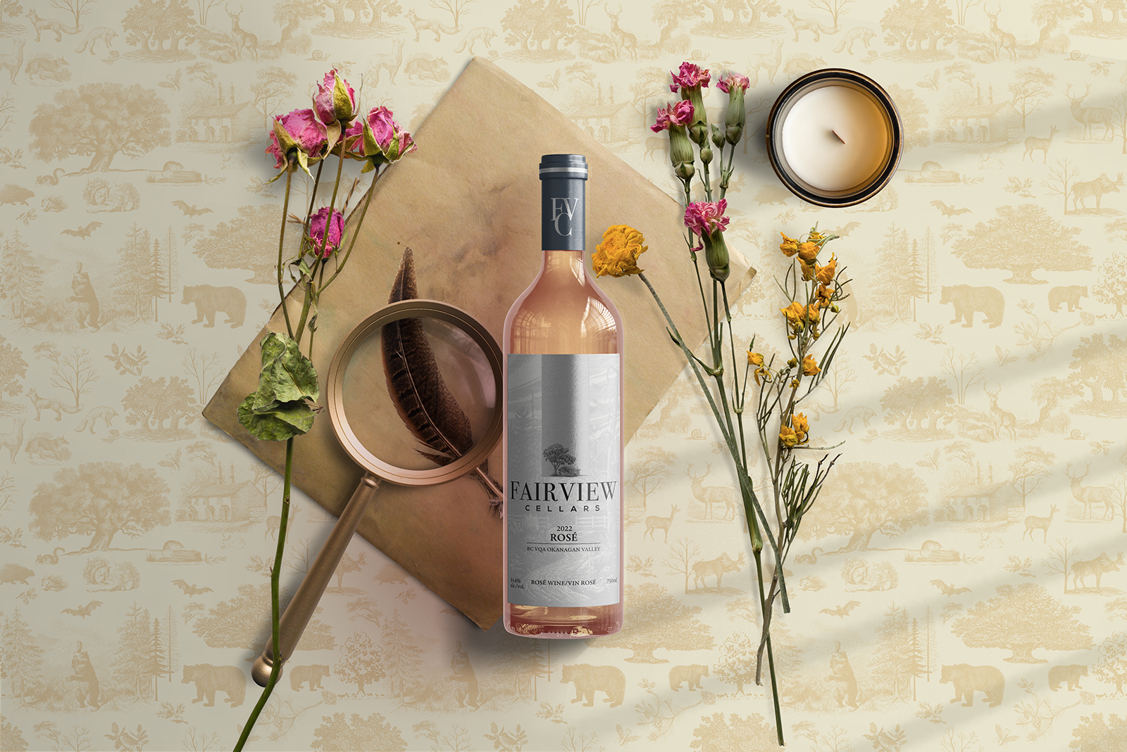
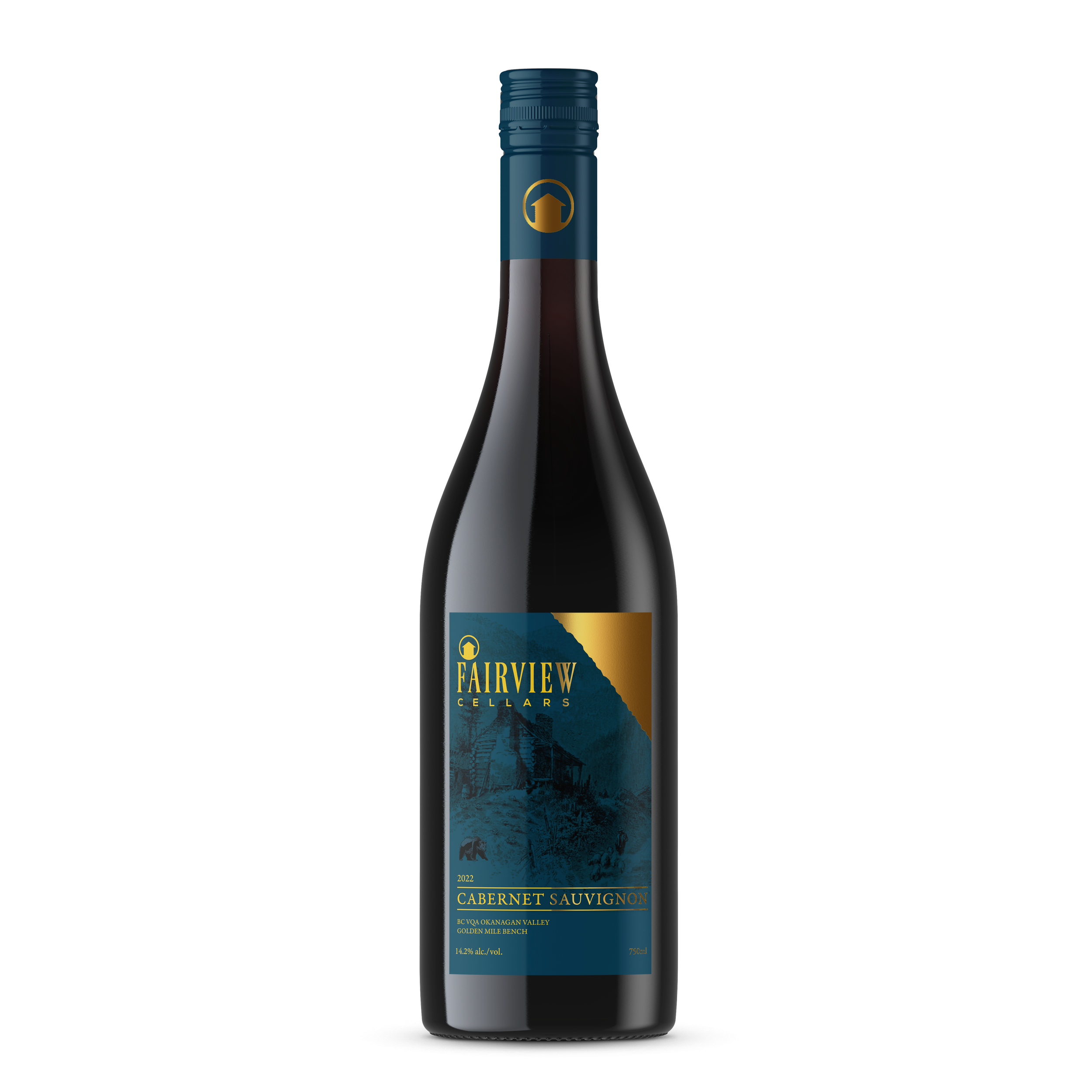
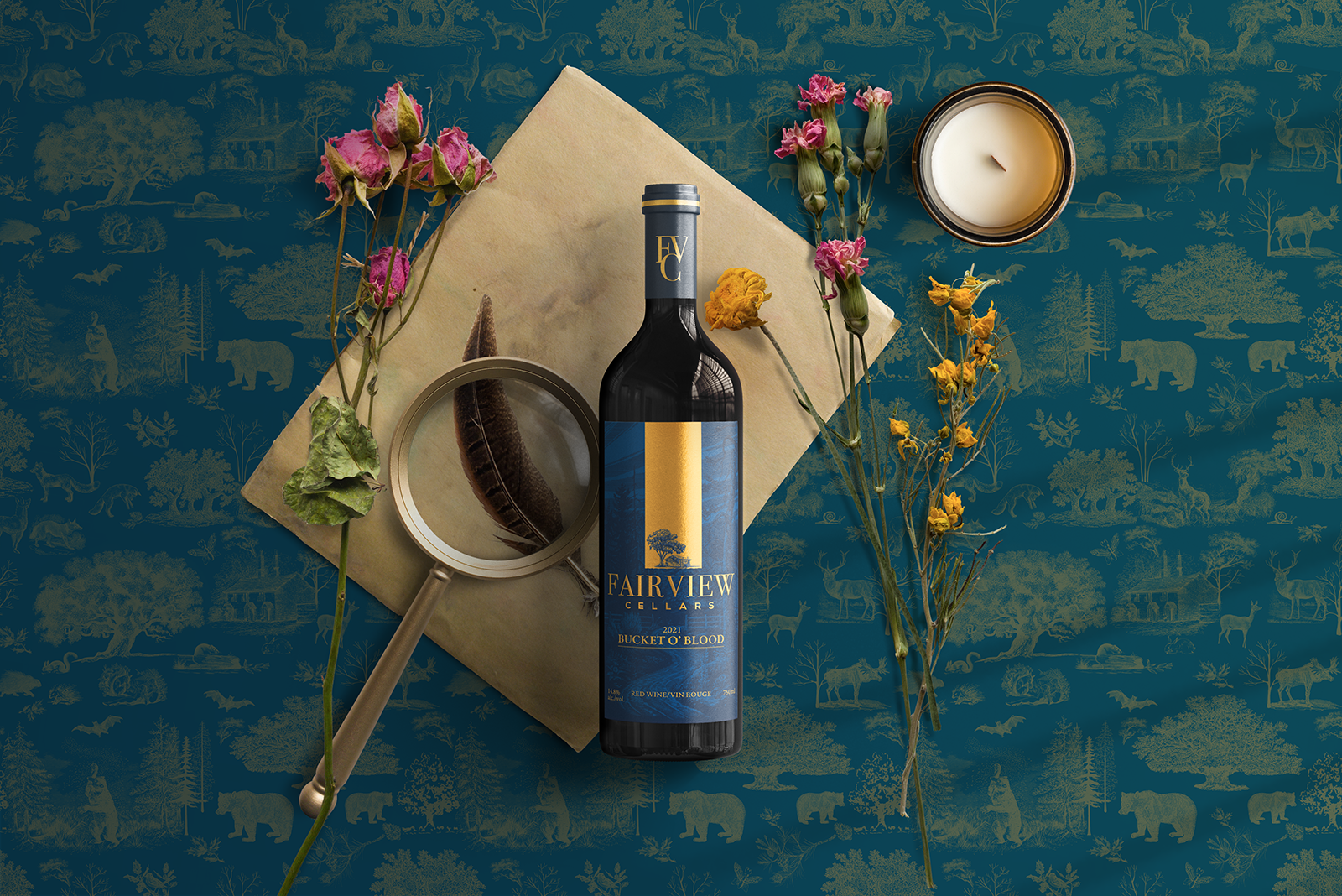
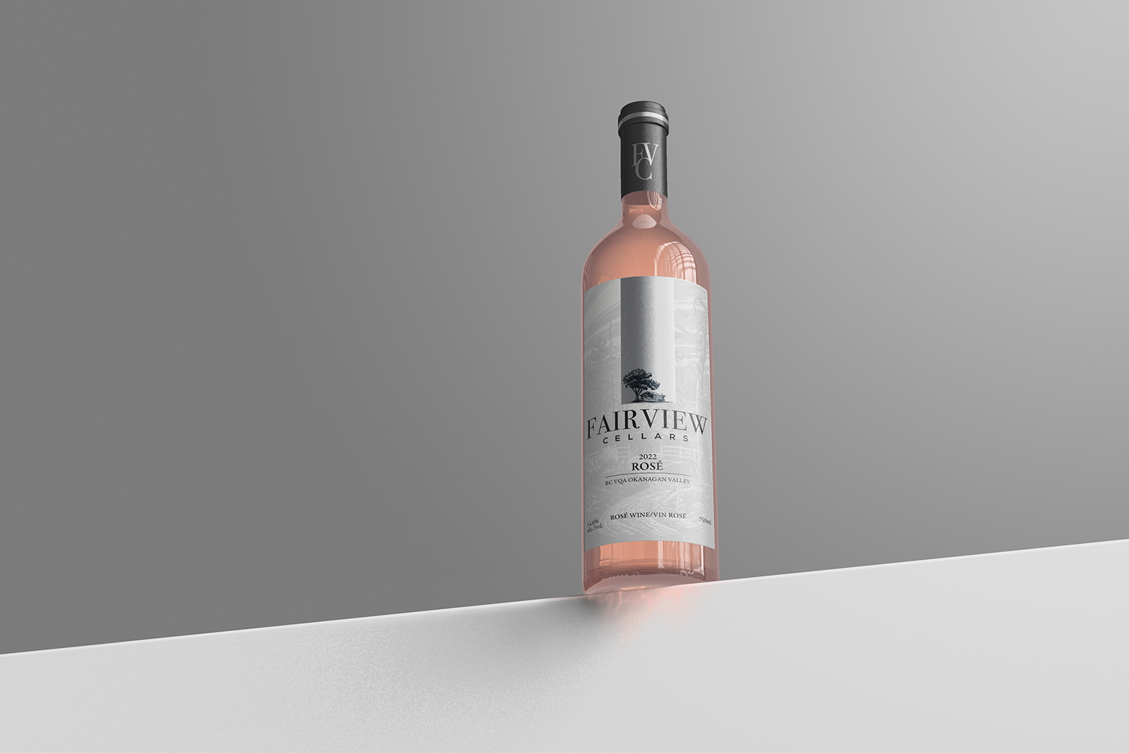
Several brand and label concepts were developed, with the cabin as inspiration for the logo. The final design moved the rustic concept to the background, literally, in the form of a vintage engraving-style illustration of a country road inspired by the drive up to the winery, while pushing the refined concept forward in the form of gold foil accents and an embossed logo.
OUTCOME
I had the pleasure of collaborating with Danielle and Dermott to refine 26 years of winemaking history into a modern brand that effectively pays homage to their past while propelling them into the future. Together, we developed a visual identity that seamlessly blended modern printing techniques, contemporary colour combinations, and cutting-edge layout with vintage-inspired illustrations. The result is an identity that effectively conveys the rich tradition and care that goes into their winemaking, while still appealing to both existing and future customers. I'm proud to have been a part of this project and am confident that the brand's future success will reflect that.
“Skyler really took the time to actively listen and guide us through our goals, values, and aspirations for the winery, ensuring that every aspect of the rebranding
process aligned with our objectives.”
