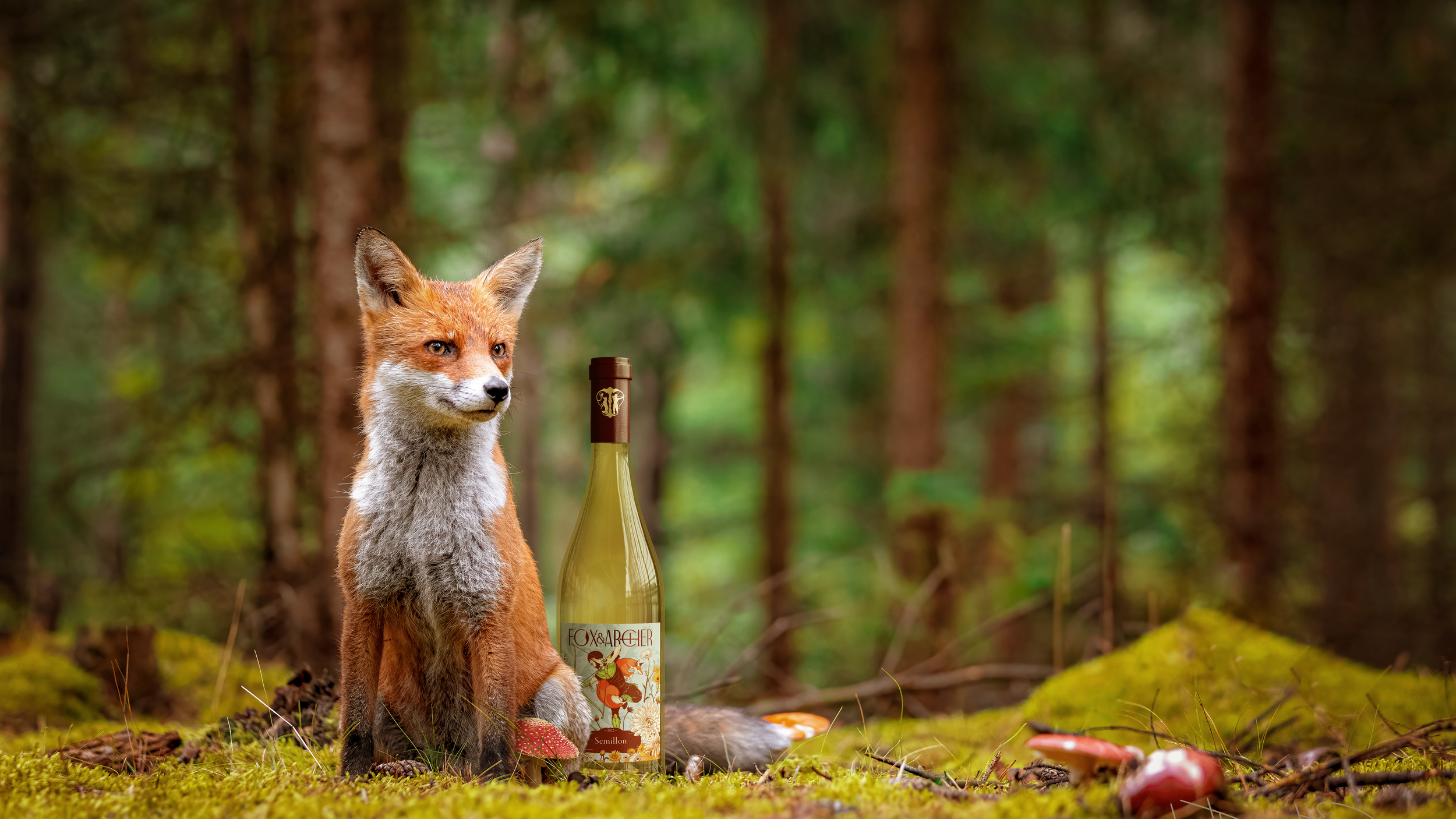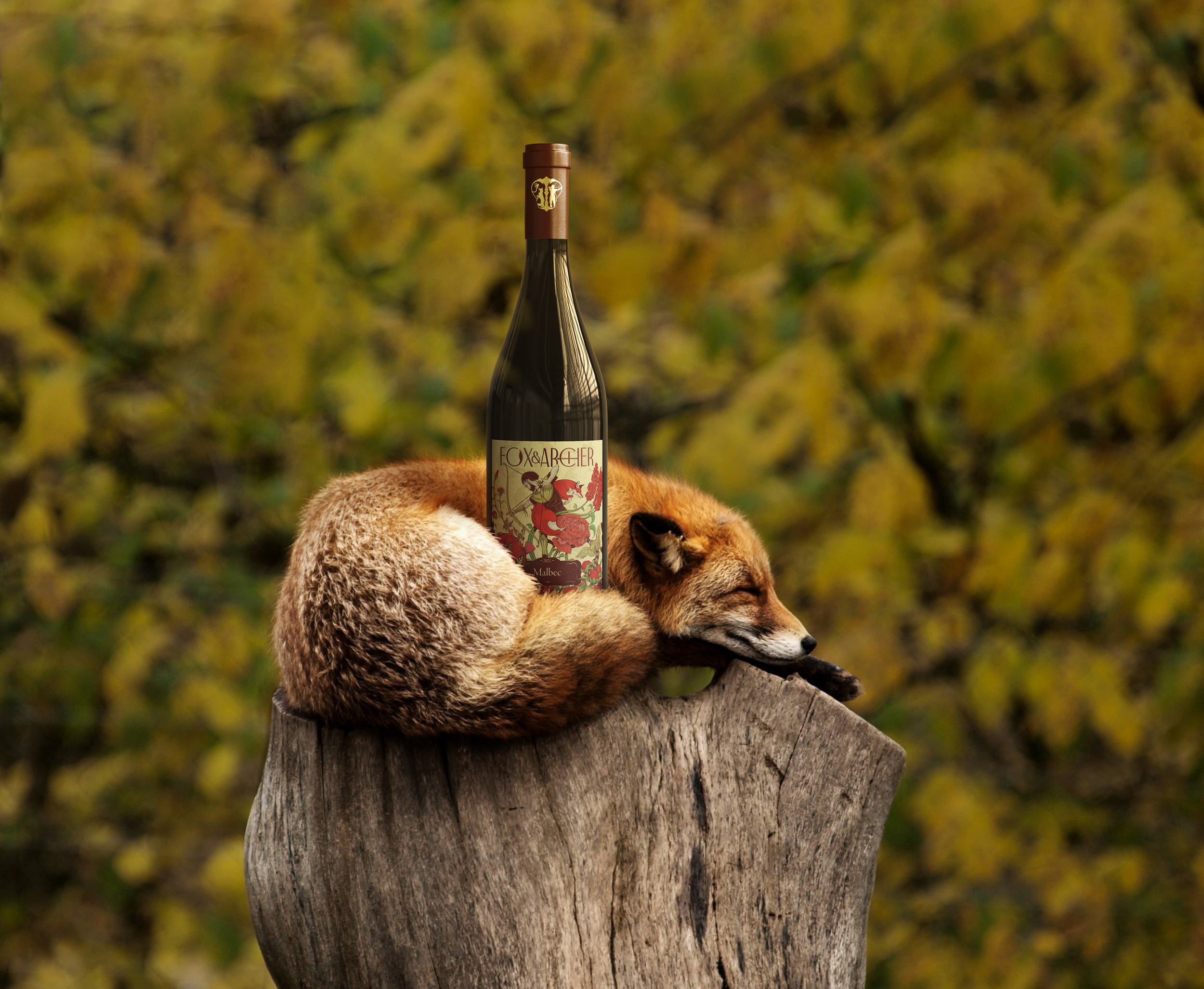
Contemporaray Illustration meets traditional wine making
OVErvIEW
Fox & Archer Winery, is a small-batch winemaker situated on the picturesque Naramata Bench. With a focus on cool climate wines Fox & Archer produces Pinot Noir, Malbec and Semillon with fruit grown and produced on their Naramata Road property.
Early in their first year of production, Diane Fox and Tyson Archer approached me to craft a brand that would speak to the tradition of wine making while, at the same time, situate the new winery as approachable and modern.
Background
When Diane and Tyson started thinking of a name for their new winery, they only had to look as far as their last names, and with that, along with a great deal of hard work planting, tending and harvesting their new vineyard, Fox & Archery sprang into being.
The only thing that remained left to do as they sat back, sipped a glass of pinot and waited for their first vintage to cellar was to create a brand that captured the unique care and deep appreciation for the tradition of winemaking that went into each bottle they produced.
The couple knew they wanted to stand out from traditional wine labels, yet still situate themselves within the historical tradition of winemaking.
In our initial talks the conversation went naturally from the aesthetics of hand-made wine to the aesthetics of art and film and soon Wes Anderson’s films such as The Royal Tenenbaums and Life Aquatic were being looked at as examples of a richly unique style that felt personal and evoked a kind of familiar nostalgia for a time that never was that pulled the viewer in.
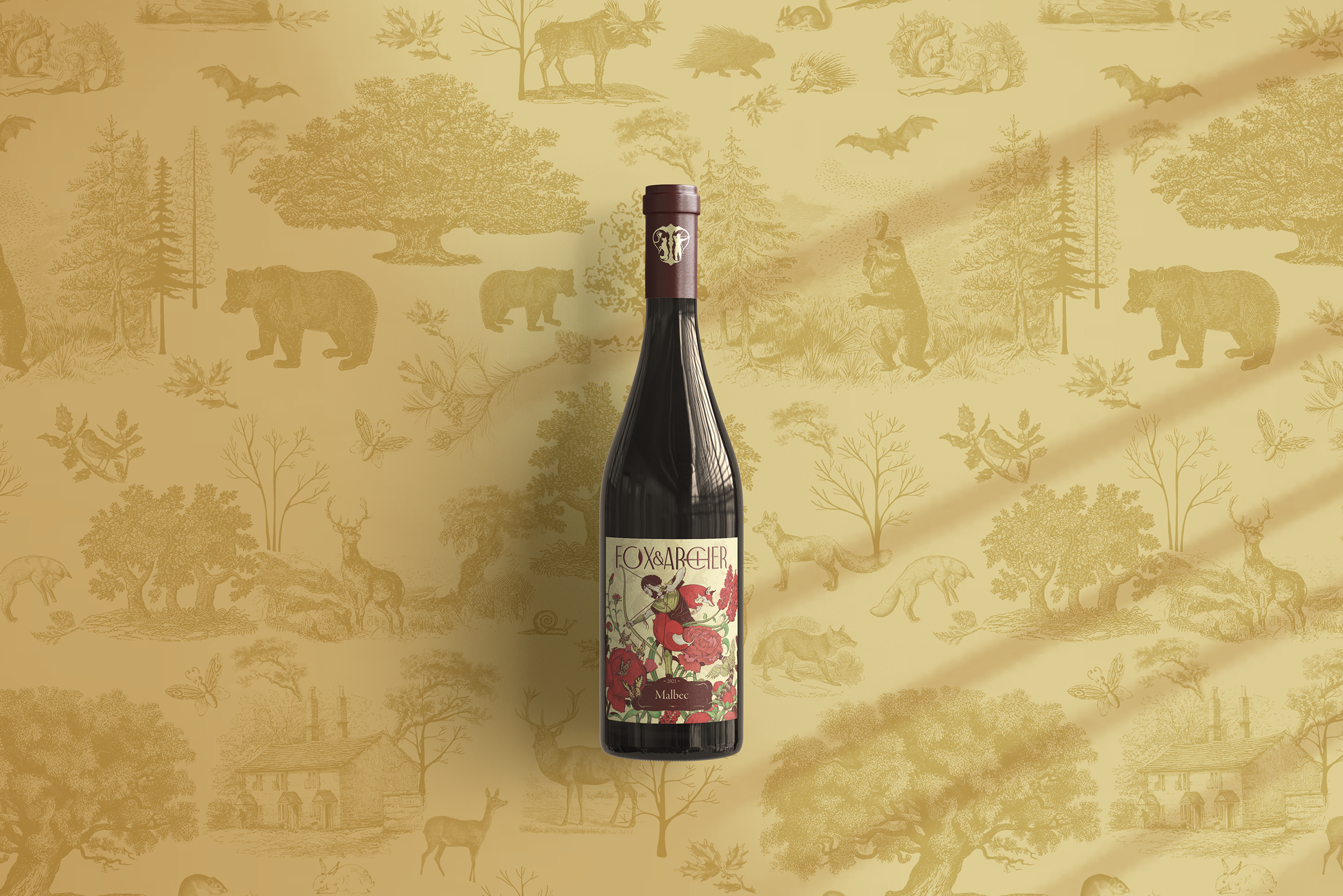
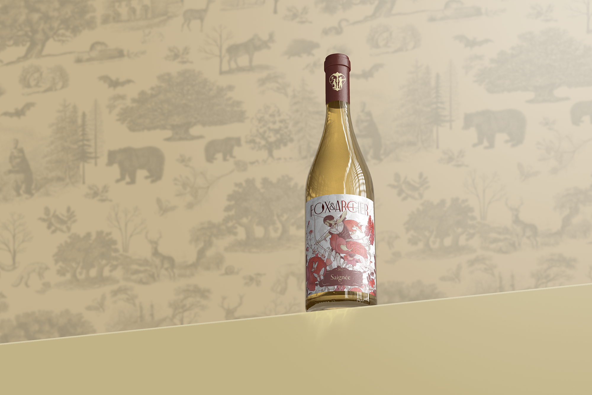
Given the rich imagery the Fox & Archer name and our initial conversation evoked, I pitched an illustrated label that stylistically harkened back to traditional English heraldry and fairy tale book illustration.
Three label sketches were produced and from the sketches I pulled out elements that would be simplified into the logo design.
Elements of the three sketches were mixed and matched into the final illustration. For example, the older, Robin Hood or woodsman from the first sketch replaced the boyish archer on the third sketch.
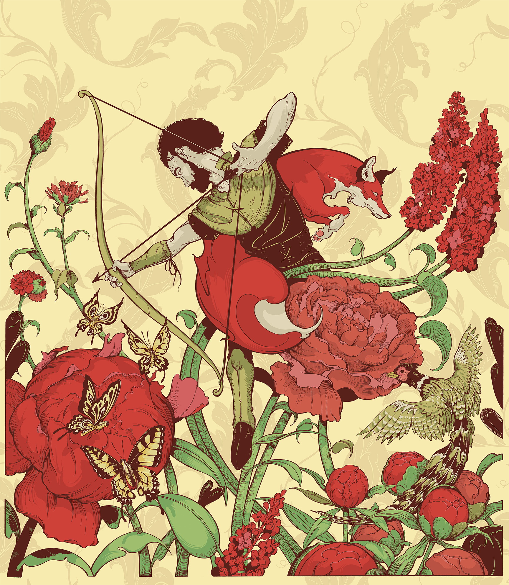
Not wanting to dispense with all traditions in wine branding, I adapted a classic heraldic crest into the logo, arranging a precocious fox and protective huntsman around entwined branches of a grape vine.
Floral elements were pulled from the flower gardens that surround the Fox & Archer home and vineyard. Colours were simplified to an iconic pallet of greens and reds to settle the composition.
For later wine releases the flowers, pallet and animals would change to differentiate varietals.
Process
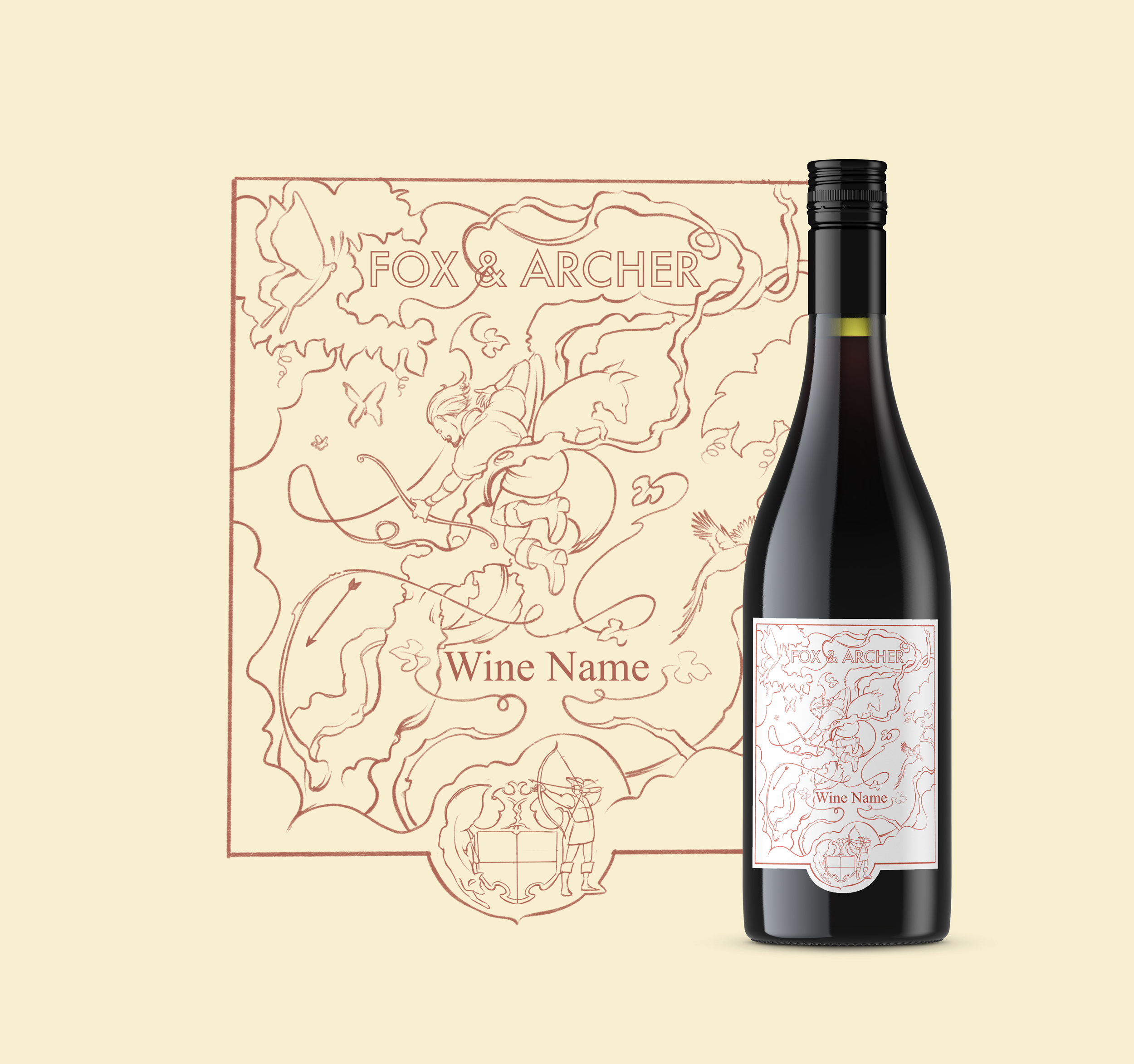
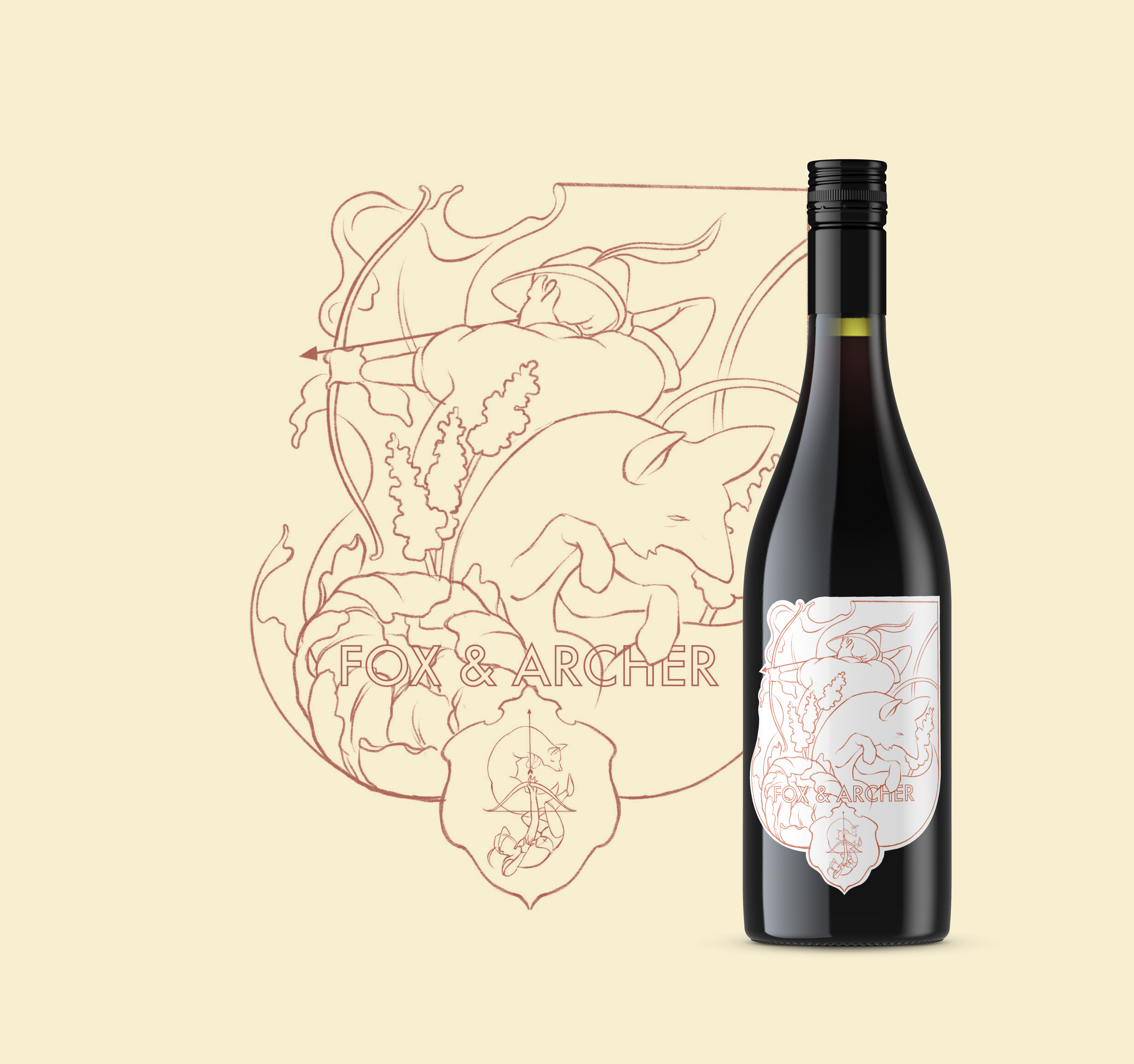
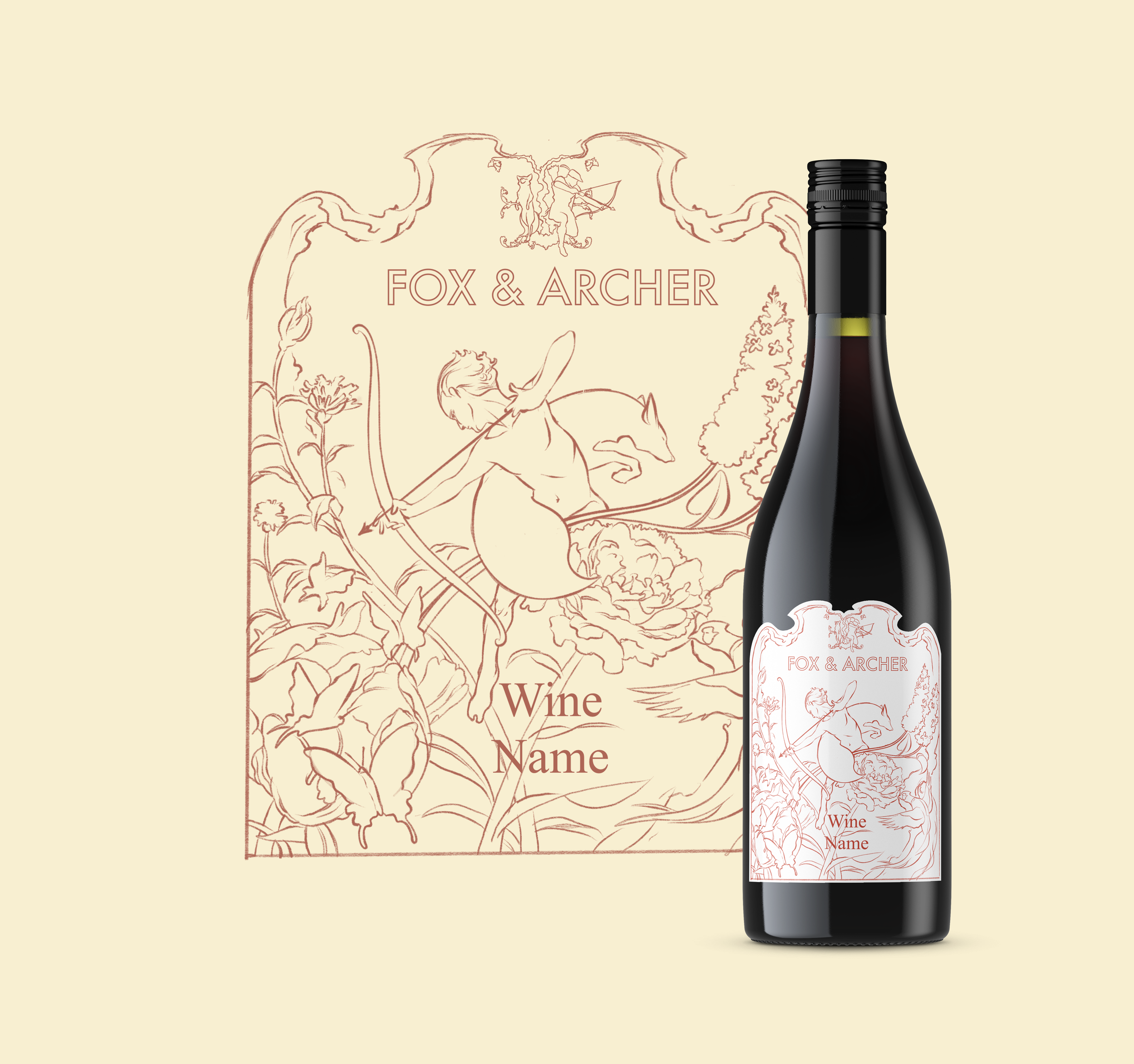
Logo sketches
OUTCOME
By combining illustration styles from old English fairy tales with the flora and fauna unique to the Fox and Archer vineyard we were able to create a truly unique brand that blends the old with the new. This blend of traditional artistry mixed with modern flare helps to showcase Tyson’s extensive knowledge of wine making techniques while appealing to a new generation of wine drinkers.
From the first look at their labels to the first taste on the tongue, Fox and Archer is a winery that doesn't just make great wine, they make a statement.
“There’s just something refreshing about having a brand that’s not just words on plain paper but rather something that is full of imagination, expression and meaning. The process was easy and our vision with Skyler’s input and experience translated into something we love.”
